↩ All Projects
Product Design Lead
Information Architecture
Brand & Marketing
2018 – 2019

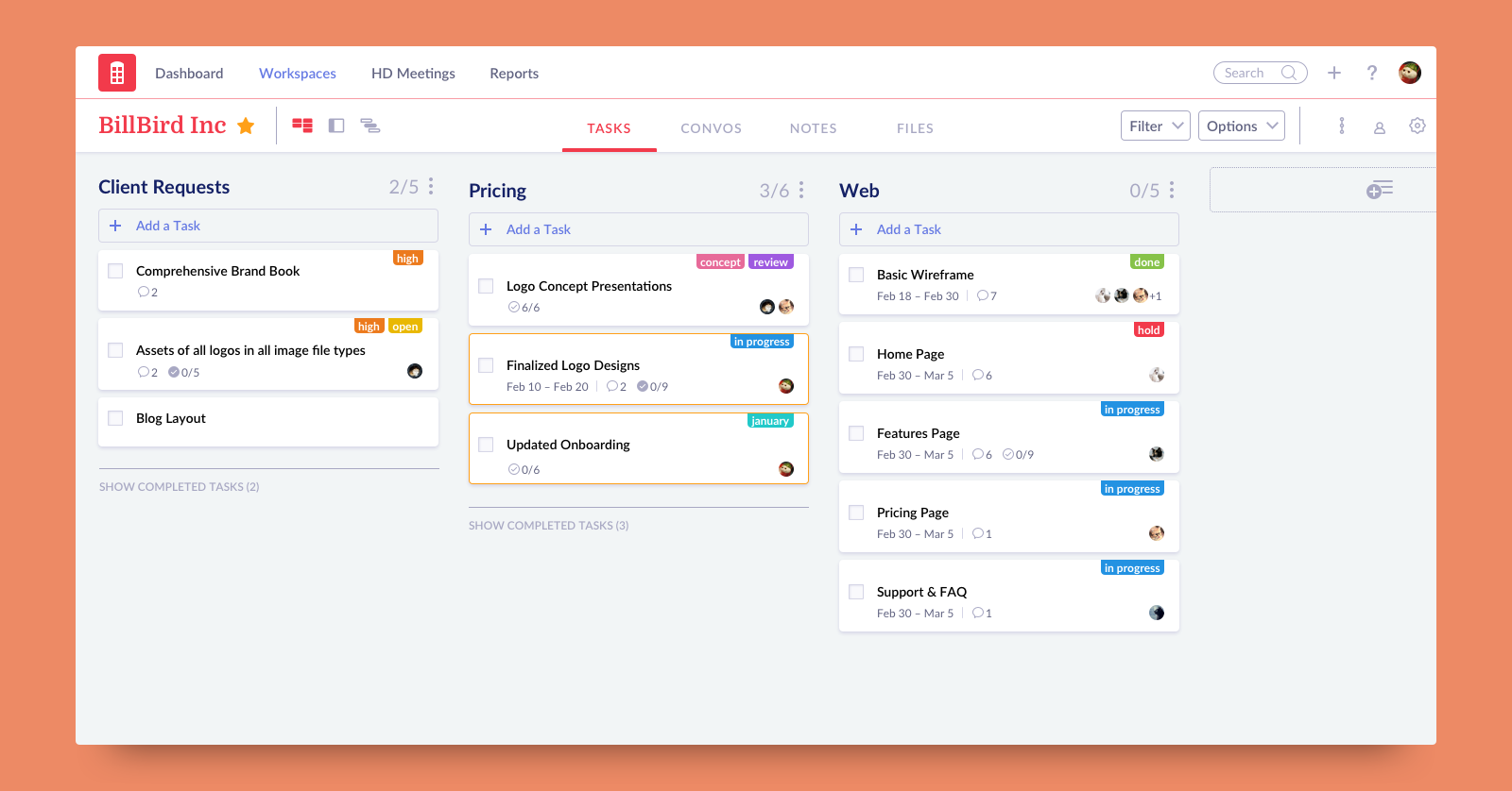
It was founded in 2008, but the company I was working for (Air Computing, Inc.) acquired it in the Summer of 2017. At the state we had adopted this product in, it was extremely impressive that the app had garnered such warm reviews from users all over the world considering it looked quite dated. I took it to task to improve the product in these following ways:
1. Clean up the interface for more customibility
2. Create a scalable system to accommodate growing features
3. Unify the experience across platforms
The design we inherited from the previous team was from 2015 (heavily Material Design inspired). The company has many passionate users that are constantly providing detailed feedback, and possibly the biggest one was for more customization options. This means many different colors for all sorts of uses. However, as you can see in the screenshot below, the theme of Redbooth was heavily tied to the business-friendly teal header for no visible reason.
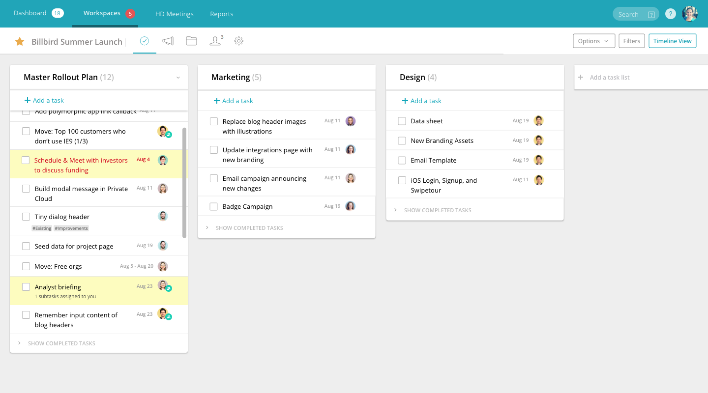
Fig. 1: Before – Redbooth's old interface circa 2015
While the feature for workspace colors existed within Redbooth on the version pictured above, the workspace color is not utilized at all in the interface of the actual workspace. In recent years, it’s been a huge trend to drain the base UI of color (à la Instagram) so that user generated content can truly shine. This principle has held so true throughout my redesign process. With a very slight and grey backdrop, you can see below that users can not only choose a color of their liking for their workspace but also drop bright tags for their tasks without clashing with the rest of the interface.
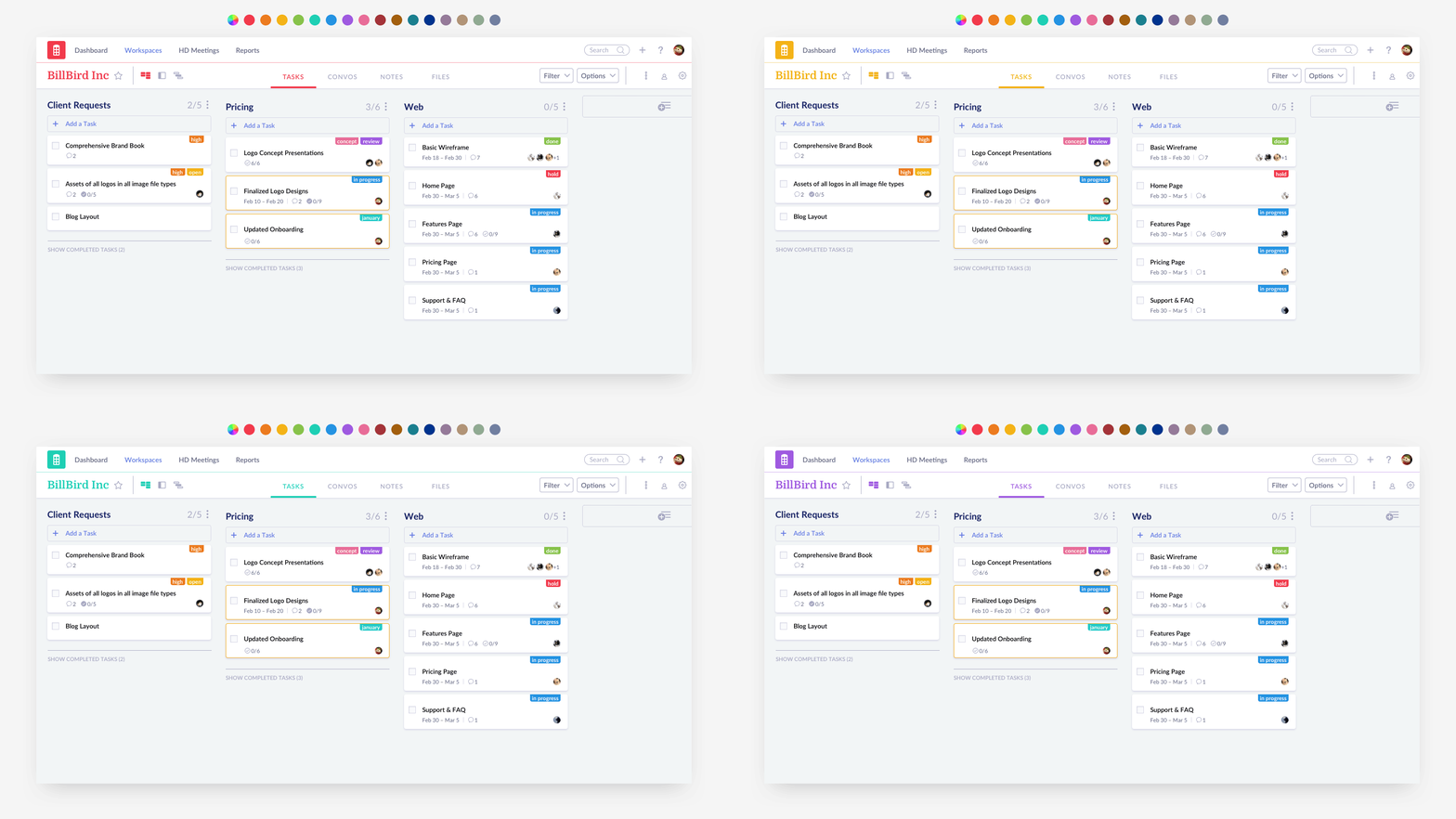
Fig. 2: Color customization in action
While changes across the product were quite extensive in order to address the second point, I think my reworking of the task cards encompass a fair amount of the problems and solutions I faced through the rest of the redesign process. I’ve included a comparison below:
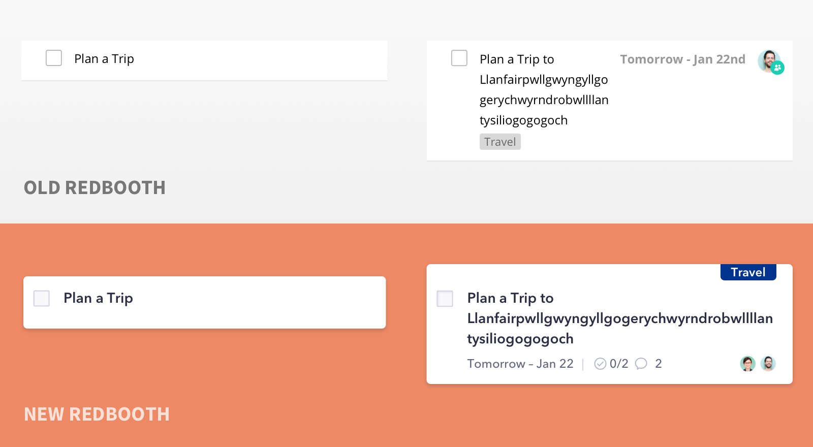
Fig. 3: Card redesign
In the previous iteration of the task card, the layout scaled poorly when more information was populated to the task. If there was a long task title along with the date, the width of each line would compete for horizontal space and be quite uncomfortable to read.
By knocking down accessory information (Due dates and assignees) down to their own line, the task title can now span the entire length of the card, providing a more natural block of text to read. This also allows me to surface even more details (number of subtasks and comments within the task) that once were hidden. By adding these seemingly small details to the task card, users know which tasks are most active at a glance without having to click anything at all.
Mobile presented its own unique set of problems due to the nature of the acquisition. The Android app created by the previous Redbooth team had stellar reviews. However, the iOS app had been rebuilt from scratch (for reasons unknown to us) and was far from feature parity, resulting in many unhappy iOS users.
Our mobile dev and I took this as an opportunity to treat Redbooth as one experience while we faced the task of redesigning and rebuilding the iOS app. For example, we added the side-scrolling Kanban board experience that is so popular on desktop. While cards and lists previously were scattered across the platforms with no easily-distinguishable reason, we made an effort to only use task cards everywhere for a familiar, clear, and scalable experience on all devices.
Fig. 4: Introducing Kanban on Mobile
Although the product on a whole looks quite different, I was constantly reminded of our loyal users who are more than happy with what Redbooth once was, so it was a tough balancing act to make the interface attractive to the new user without disrupting the older one’s process. To ease existing users into the new UI, the engineering team rolled out the changes in several hybridized skins. We decided to rip off the bandaid by removing the teal header first and replacing it with a more modern indigo, just so this most visible change wouldn’t overshadow some truly valuable feature additions.
All in all, the somewhat strange nature of how this redesign landed in my lap has delivered so many valuable lessons. It’s so easy to want to overhaul everything at once, but that’s both taxing on the engineering team and, more importantly, to the users. This design is still fresh, so I guess we’ll wait and see if the numbers reflect the positivity I feel about my work. Based on a poll we conducted with our existing users through Intercom, the reception to new design elements have been 89% positive, which is a win in my book.
Of course, every redesign, no matter how small, will be met with some change aversion. Using our highly active feedback forum, I made some changes based on the most pressing pain points that the redesign had caused. In this update of the redesign, the header is much more responsive and allows for a longer title. The card layout has also been altered to be more condensed and clear as per our user feedback.
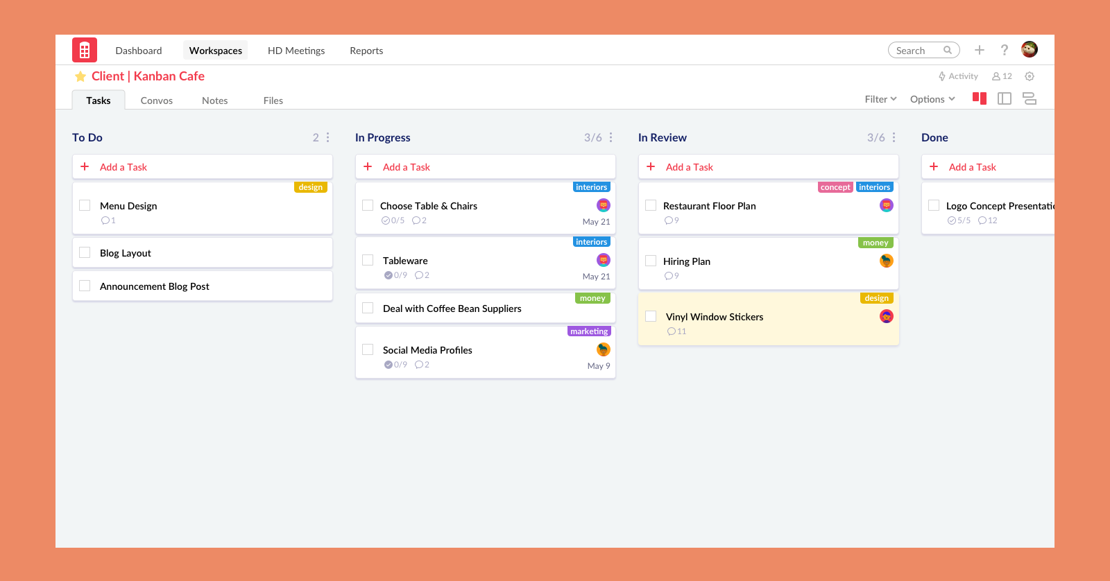
Fig. 5: Post Redesign Update