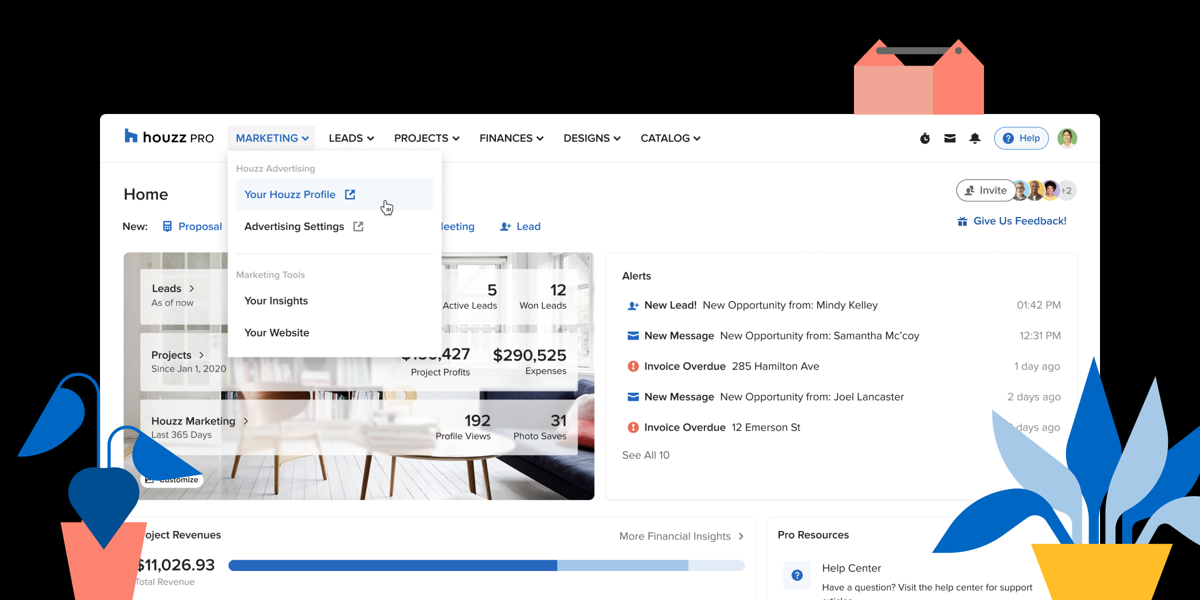
↩ All Projects
Product Design Lead
Information Architecture
User Testing & Research
2019 – Now (Ongoing)

Outside of their expected jobs, most of the home professionals using Houzz (subsequently referred to as “pros”) run small business operations where they have to wear multiple hats, from marketing to finance to client management.
Houzz Pro is here for those pros to streamline their operations so they can focus what they love doing – creating meaningful spaces that last.
Historically, Houzz’s business model relied heavily on an advertising subscription program for pros to showcase their work and get new business.
However, with the growth of the platform and inevitable increase of competition between pros, we discovered that pros were growing increasingly dissatisfied with the amount of new business leads that they were receiving from Houzz.
We found that there really was no other platform that was capable of offering pros a way to connect with homeowners, source their home furnishings and hardware, and manage their projects like Houzz could.
Thus brings us to the inception of Houzz Pro, an all-in-one tool for home professionals to grow, market, and manage their business.

Diagram of Houzz Pro offerings
When I had joined the Houzz Industry Solutions team, the leadership had already begun working on conceptualizing what Houzz Pro could look like. Unfortunately, they had not invested in speaking with our users to understand what their mental models of all the tools they use look like.
Thus, the first navigation design of the Houzz Pro MVP (minimum viable product) was driven mostly by HiPPO – Highest Paid Person’s Opinion. We had put all our chips into a streamlined but inflexible organization where all features were organized abstractly into categories titled “Grow”, “Manage”, and “Source”.
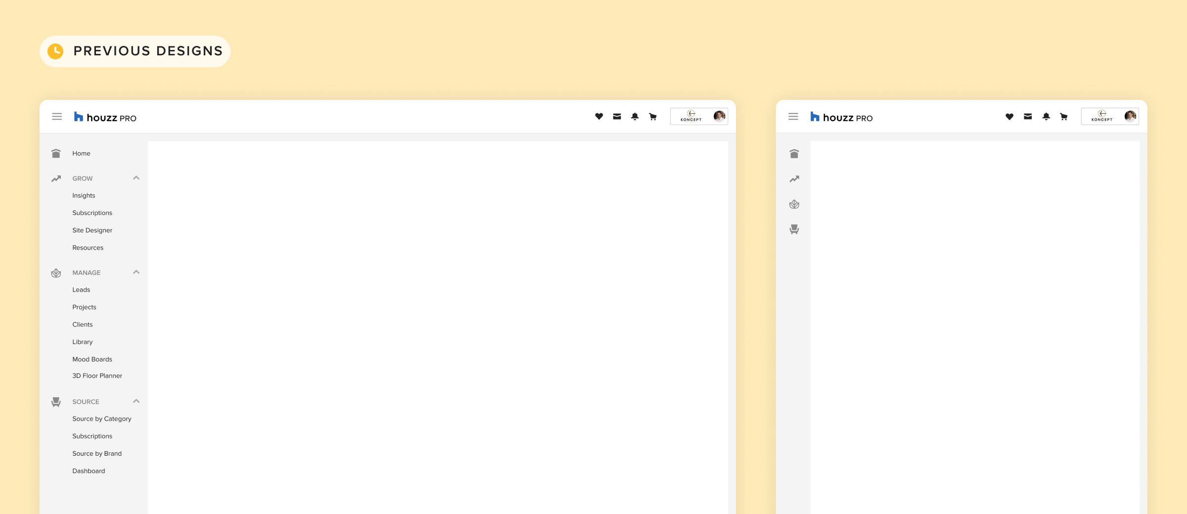
Version 1 of Houzz Pro
There were a couple of key problems with this first solution:
I first had a meeting with our key stakeholders to map out all of our product features and pages.
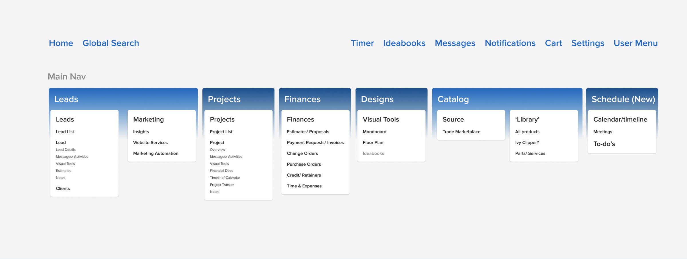
Site map for stakeholder discussions
Then, I worked with our user researcher to schedule user testing sessions in which we performed a simple card-sorting exercise to understand our pro’s mental models.

Proximity mapping from the card-sorting exercise
Prototype 1: Vertical Primary Navigation
Prototype 2: Horizontal Primary Navigation (Winner)
Initially, I’d just wanted to test Prototype 2: Horizontal primary navigation. However, we decided to keep a version that was closer to the control to see if smaller changes could be made. So, we kept our minds open to both options as we proceeded to user validation.
We did both unmoderated quantitative and interview-based qualitative tests to validate these design directions.
Quantitative testing: We set up a list of pages for the participant to complete using the prototype. The horizontal navigation had almost double the successful task completion rate than the vertical navigation did.
Qualitative testing: Much to our happy surprise, every single professional that we interviewed preferred the horizontal top navigation. They thought that this treatment presented Houzz Pro more as a holistic, unified experience. They also appreciated the dropdown under each menu item that helped them quickly access what they were looking for.
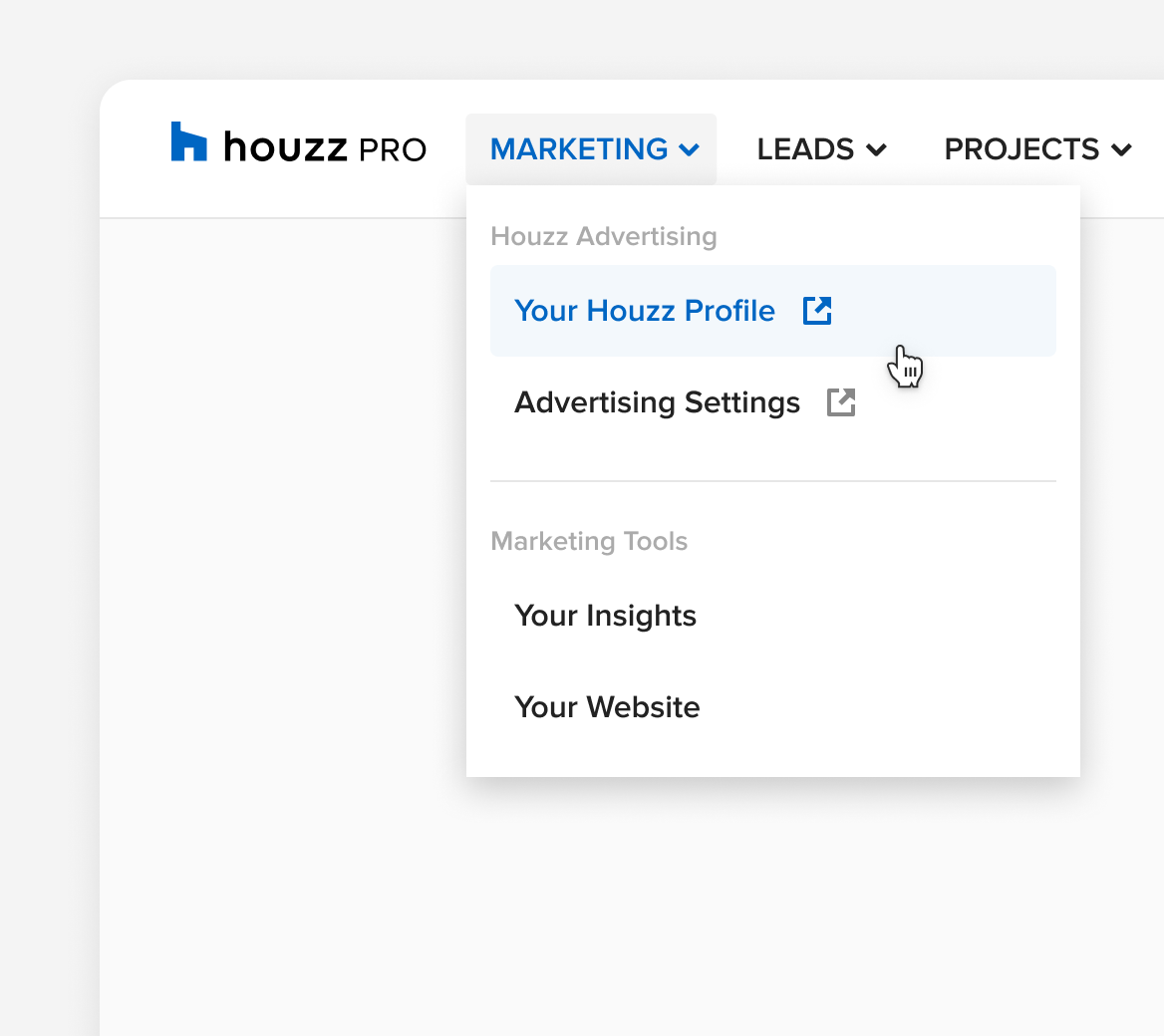
Dropdowns
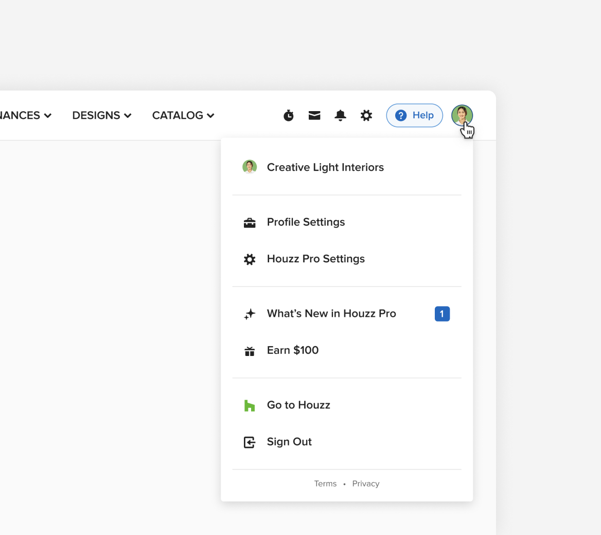
User Menu

Level 1 Page: Top level pages for each pillar of the product

Level 2 Page : A specific project or lead page
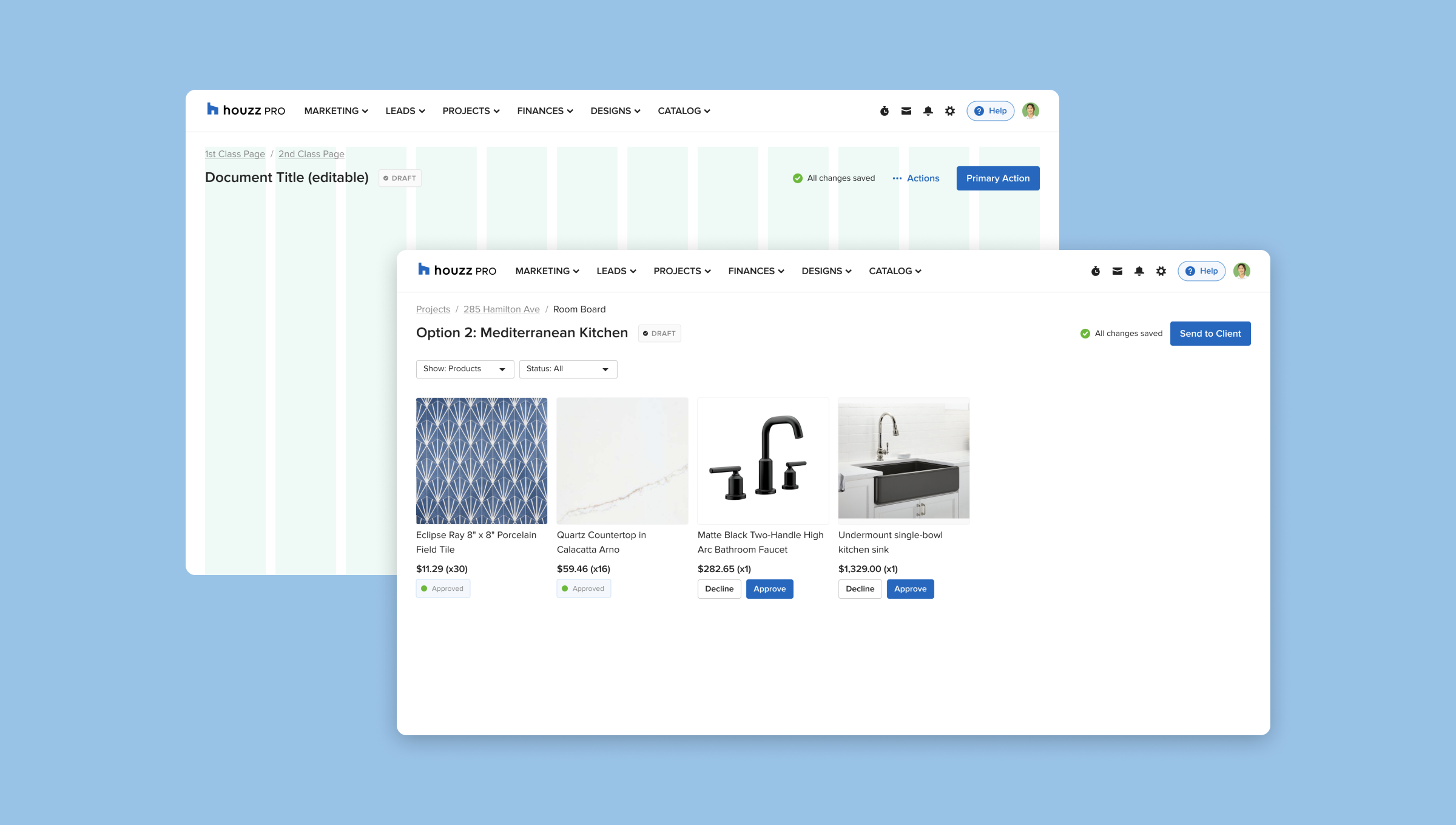
Level 3 Page : Documents that are nested within a project or lead
We really started off on the wrong foot by not getting early input on the directions we were pushing. I think this effort really proves how straightforward things can be if preliminary, rapid research was done to vet early concepts instead of searching for approval from company executives.
We’re hoping to see a lift in engagement and retention as a result of this large redesign effort. I genuinely feel like this is one of the only projects that I’ve had the luxury of doing by the books. Given the clear success of the user testing, I’m so excited to see how this impacts our numbers!
Thanks so much to these awesome people:
Xin Guo, Liscelyn Griffal, Inbal Malca, Tal Levy, Rachee Jacobs, Dave Anderson, Zach Peng (Design Cohort & Emotional Support)
Emerson Yu (Engineering Lead)
Roy Frenkiel (Director of Strategy)
Kelvin Young (Design Manager)
Paul Otto (Research)
Yeseul Son (Iconography & Illustration)